
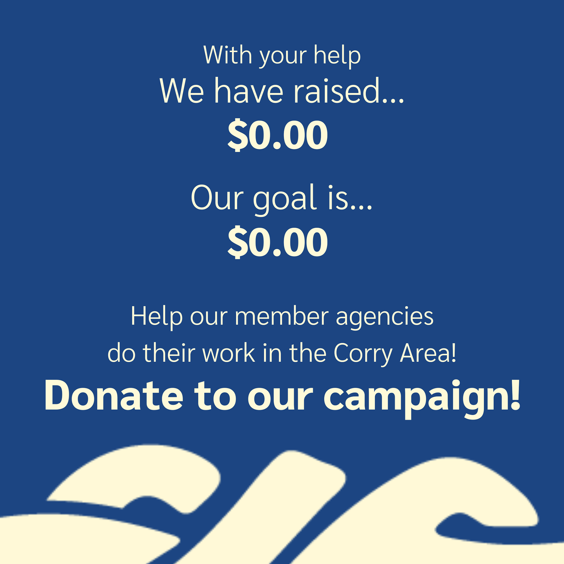
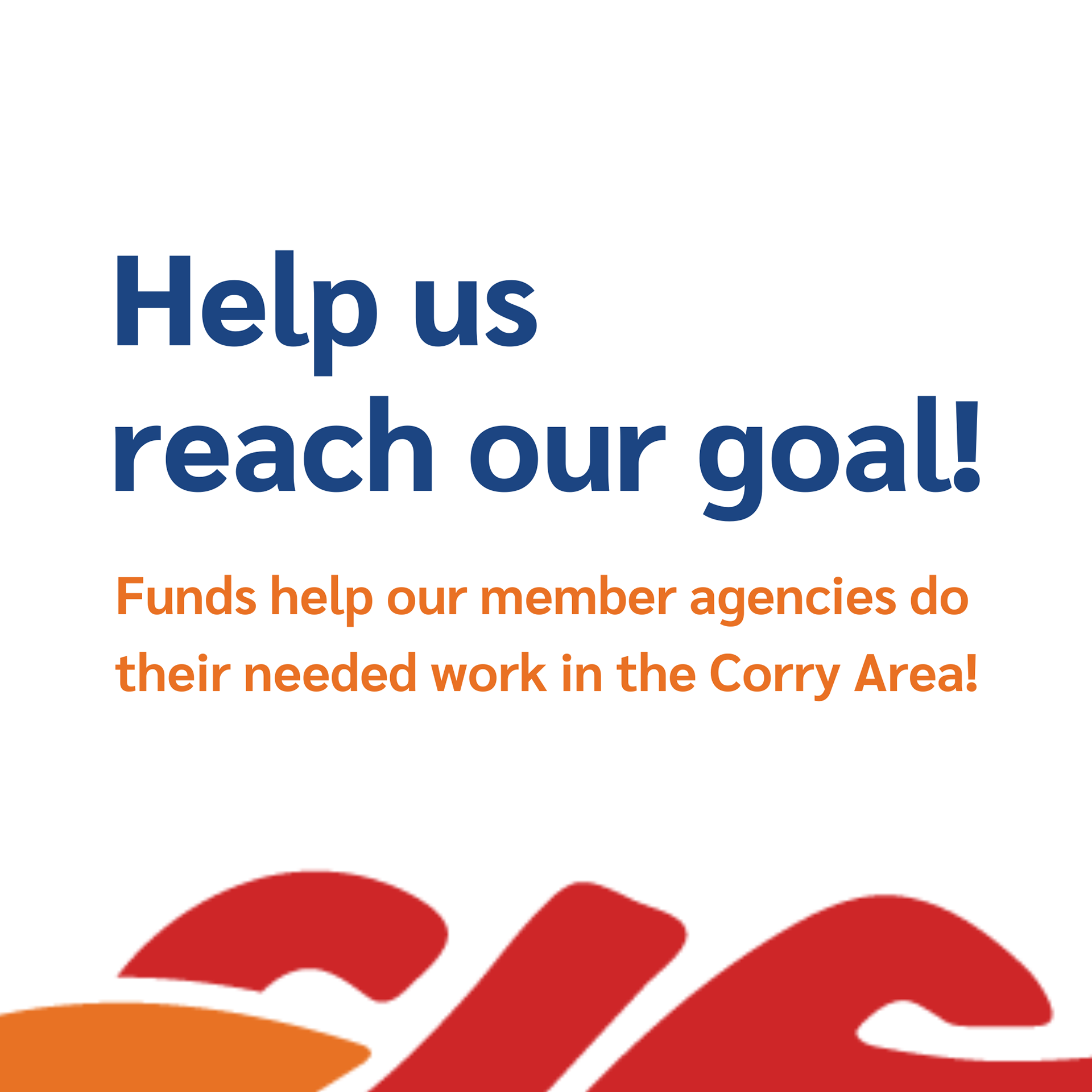
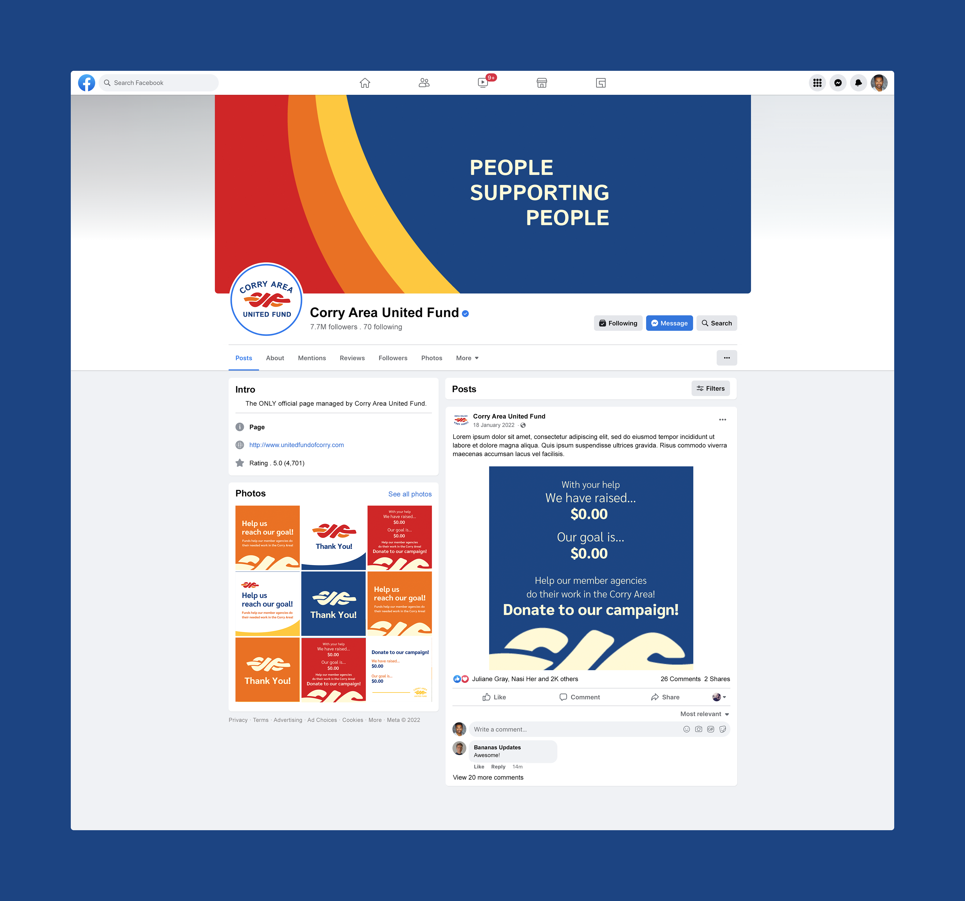
For this client, my team created a mark for corry area united fund as a way to bring the fund more presence in its community. through the image of the knot, we created that idea of connection and facilitation that the fund treasures. we also chose colors based on the area itself and their requests for a more autumnal palette. through the typography, we allude to Corry's industrial past while still allowing this mark a way to live for the next 50 years. As part of my contribution, i created a social media campaign complete with editable templates for their team to use in the future.
Team Roles
CREATIVE LEAD | Grace Maust
COMMUNICATION LEAD | Jacob Steadman
PRODUCTION LEAD | Mia Parise
COLLABORATION LEAD | Brianna Signorelli
PRESENTATION LEAD | Maddigan Bless
LOGO CREDIT | BRIANNA SIGNORELLI