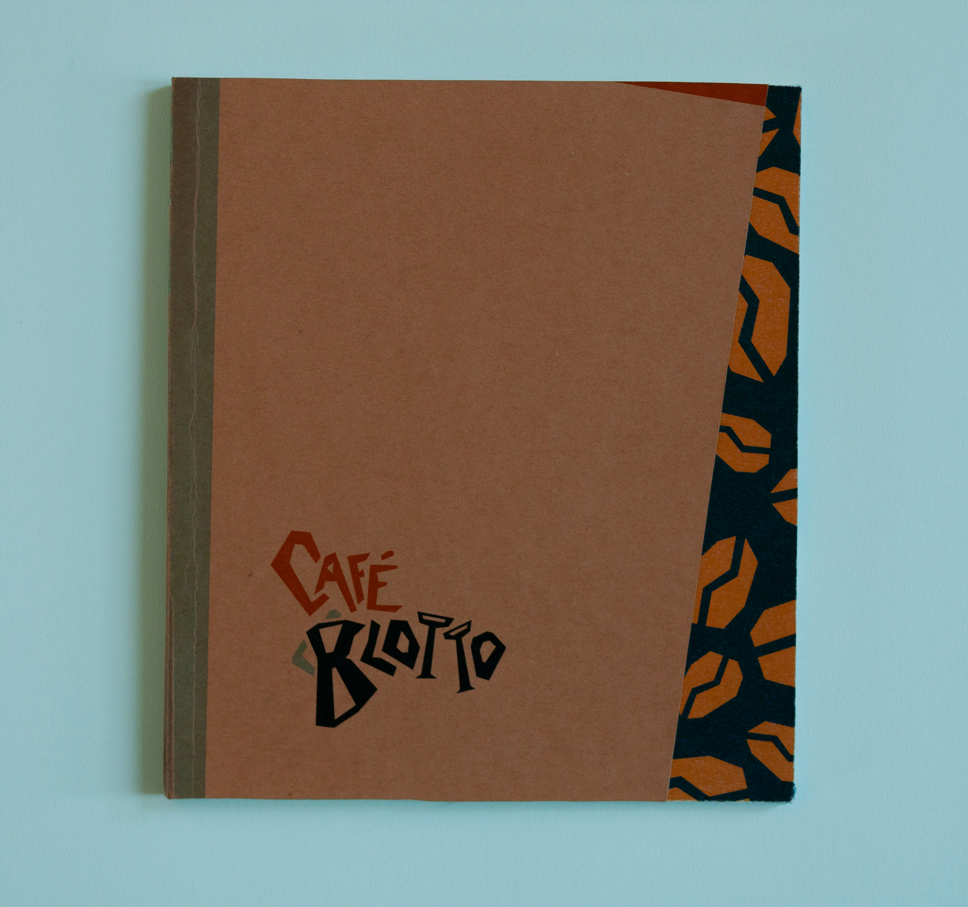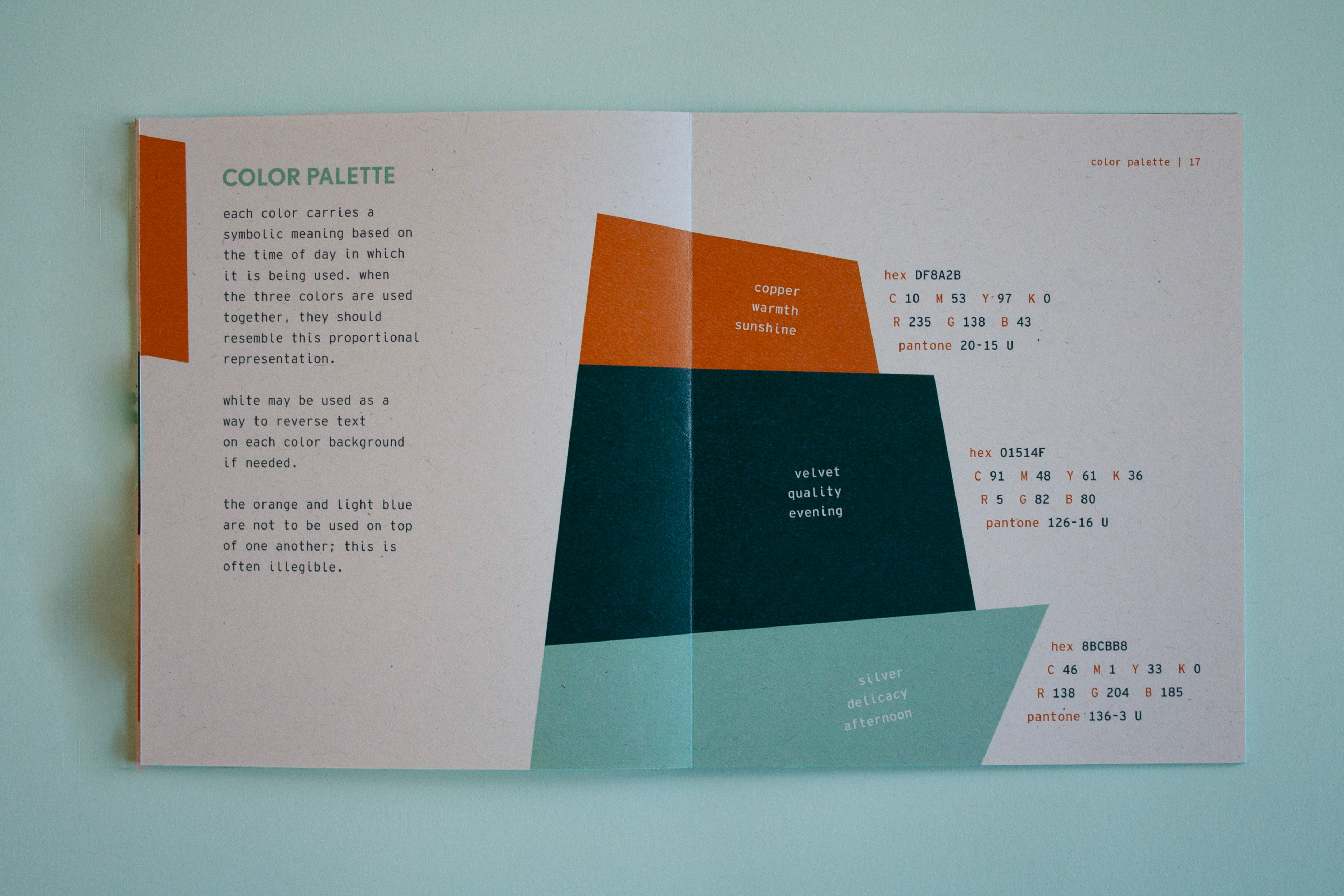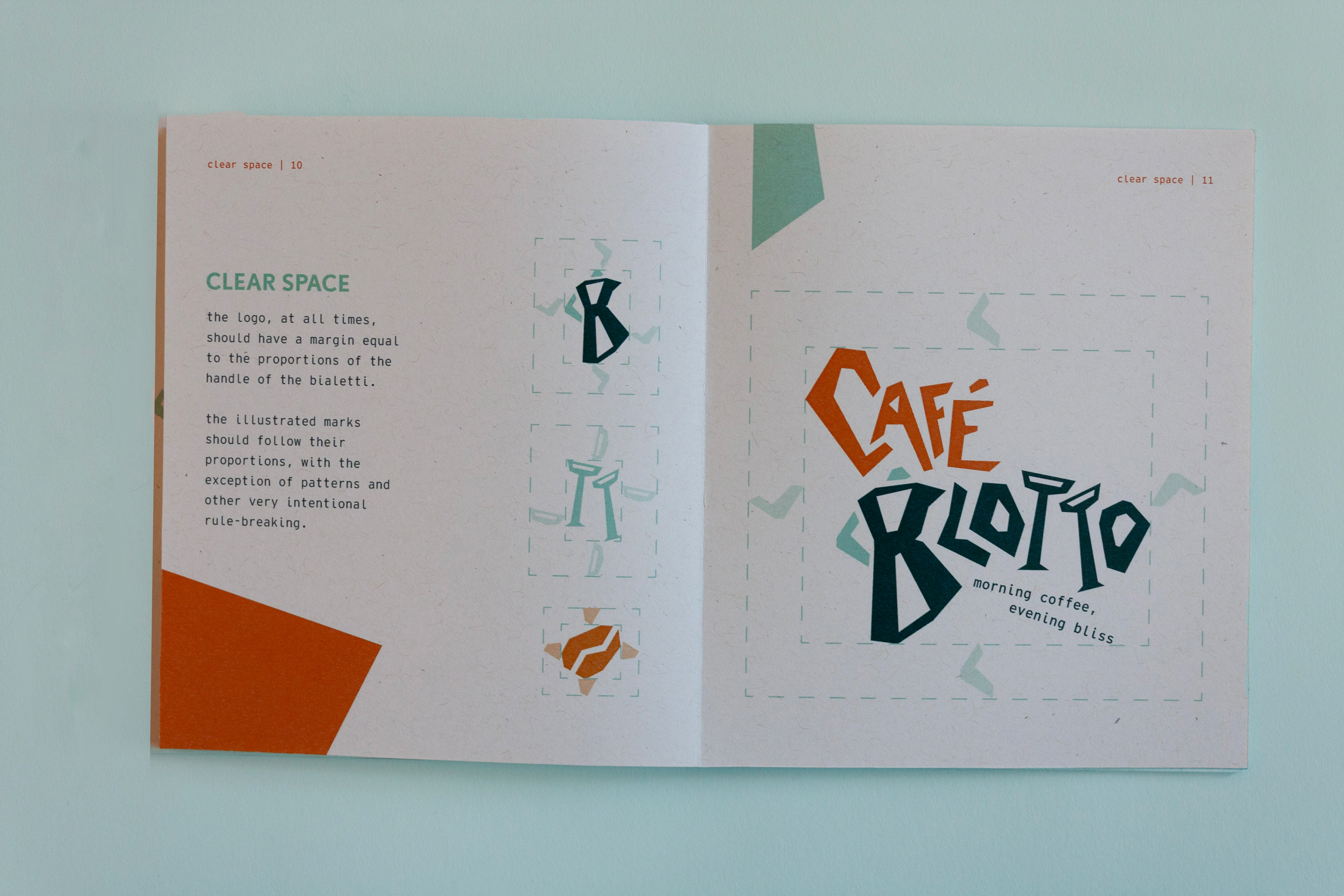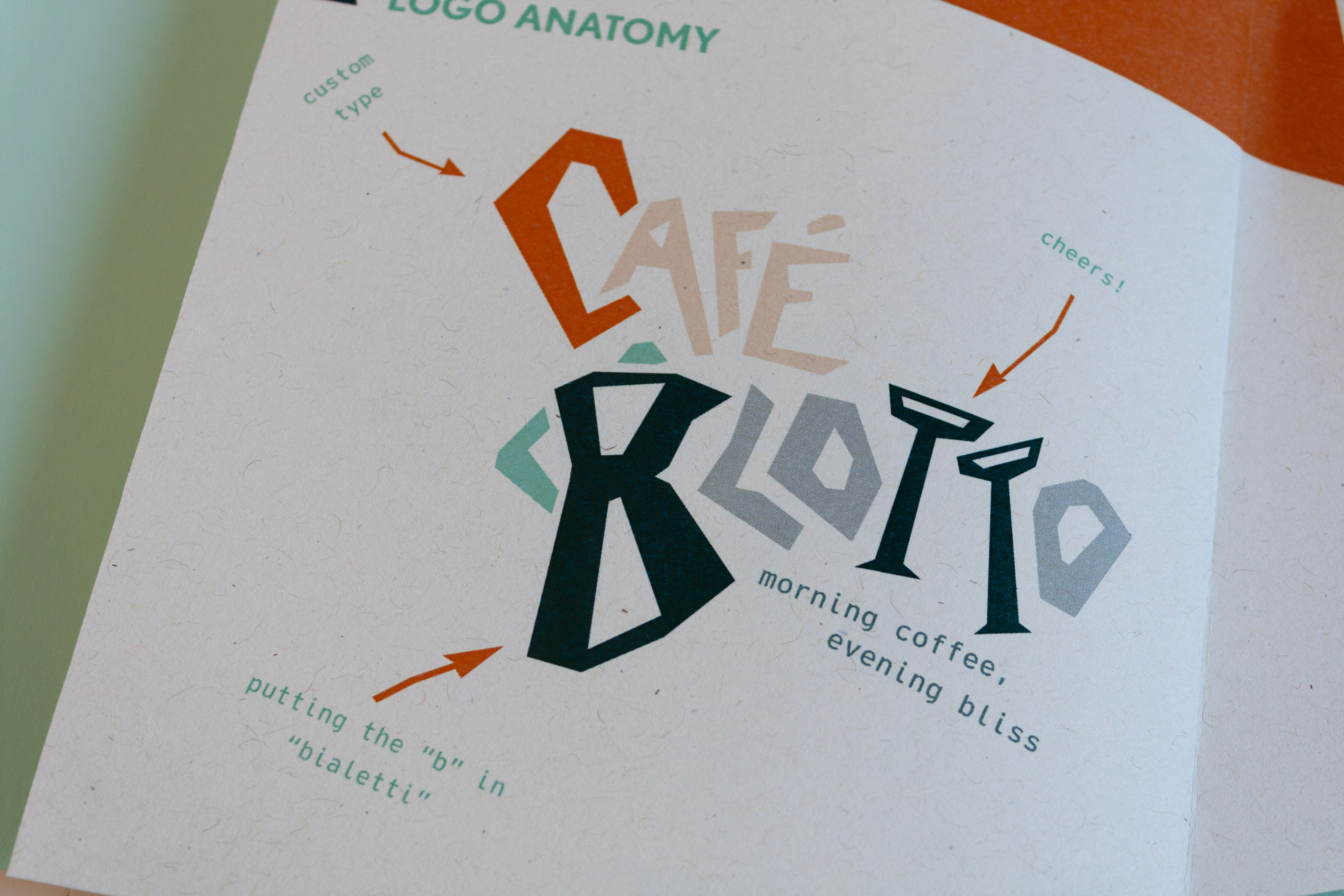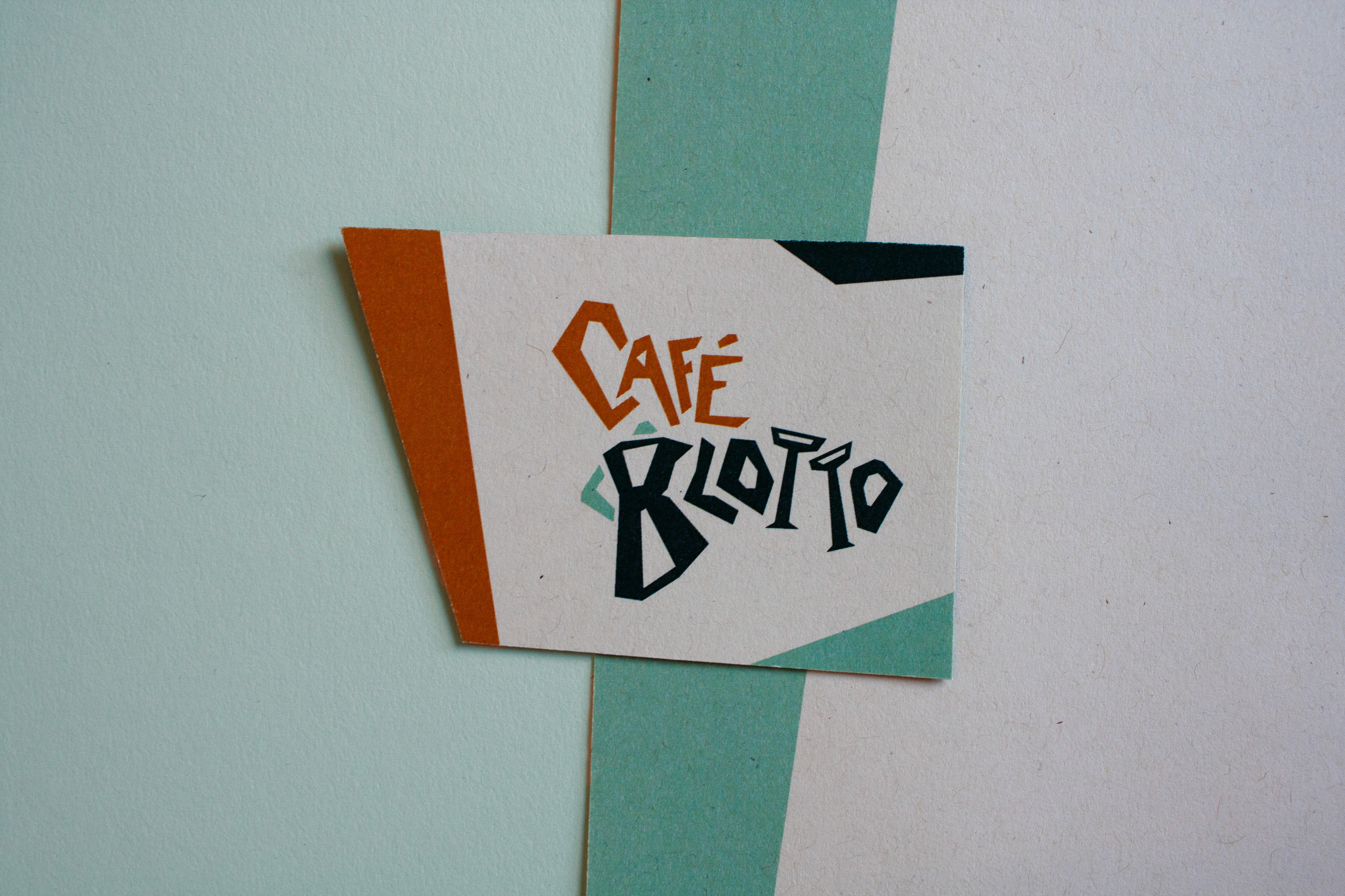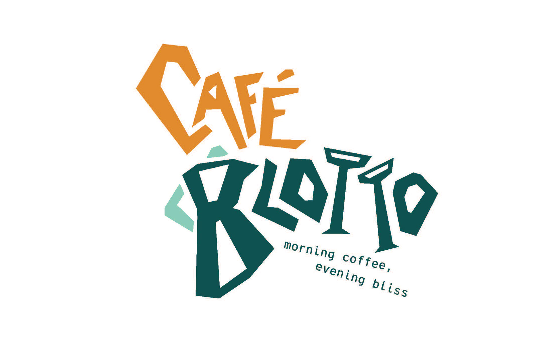
the identity system for this hypothetical café and speakeasy plays on the idea of a junction between day and night. in a syncopated approach to illustration, type, and collateral, the idea of a morning jolt from a cup of coffee and the excitement of nightlife come together to form this brand. café blotto has a color palette based on materiality, taking inspiration from emerald green velvet, orange copper, and cool silver. the duality of the logo lies in the illustration of the bialetti as the capital b in blotto and the champagne glasses as the double t’s in blotto.
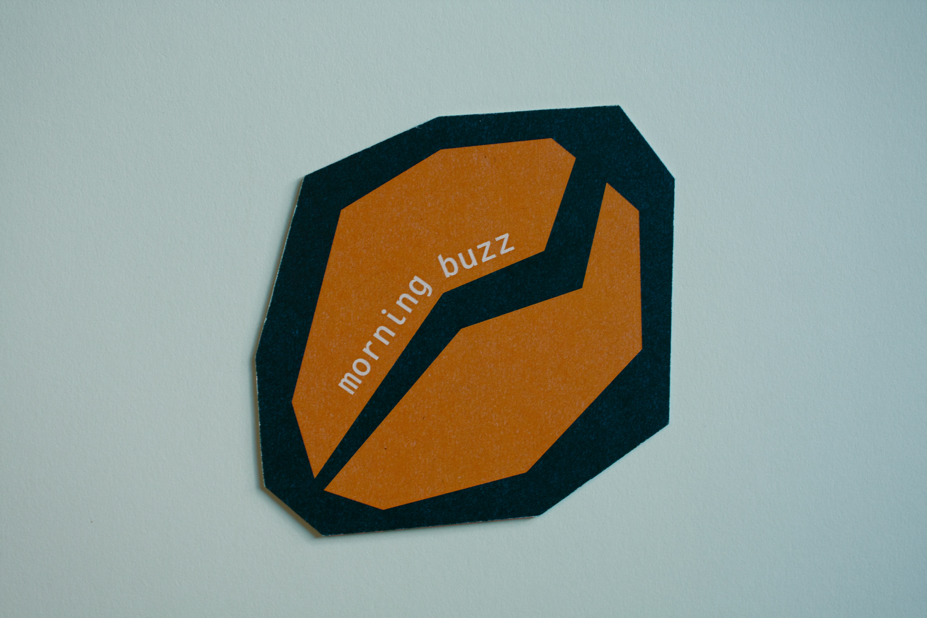

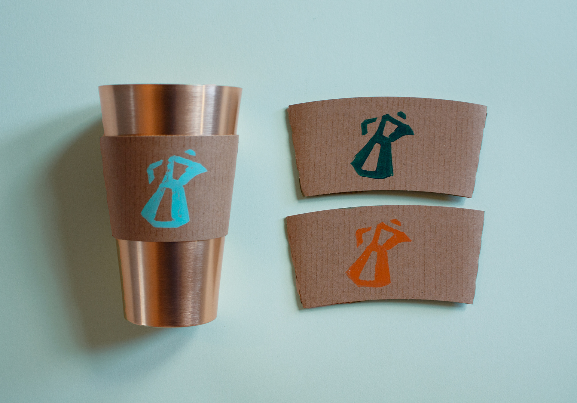
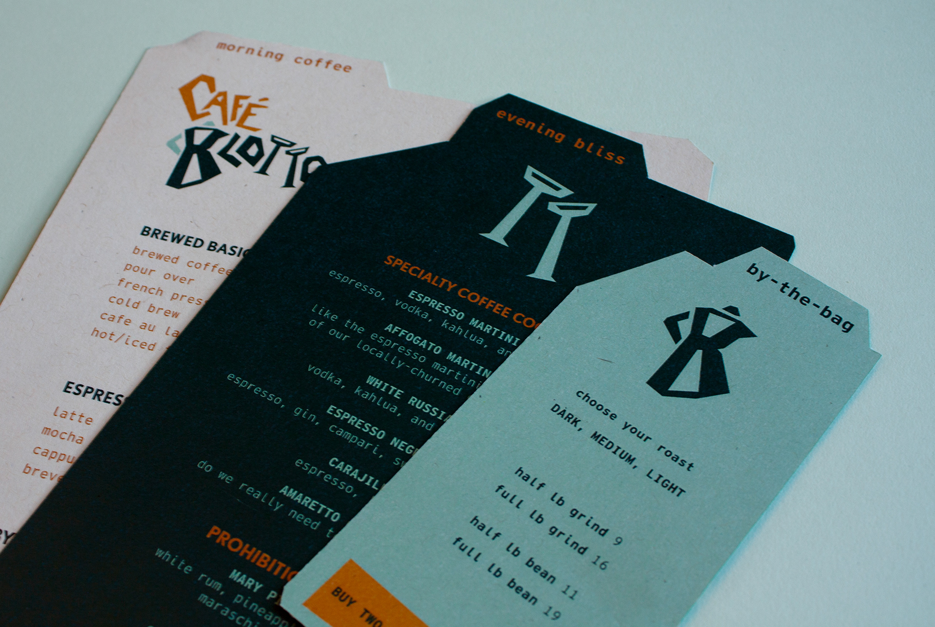
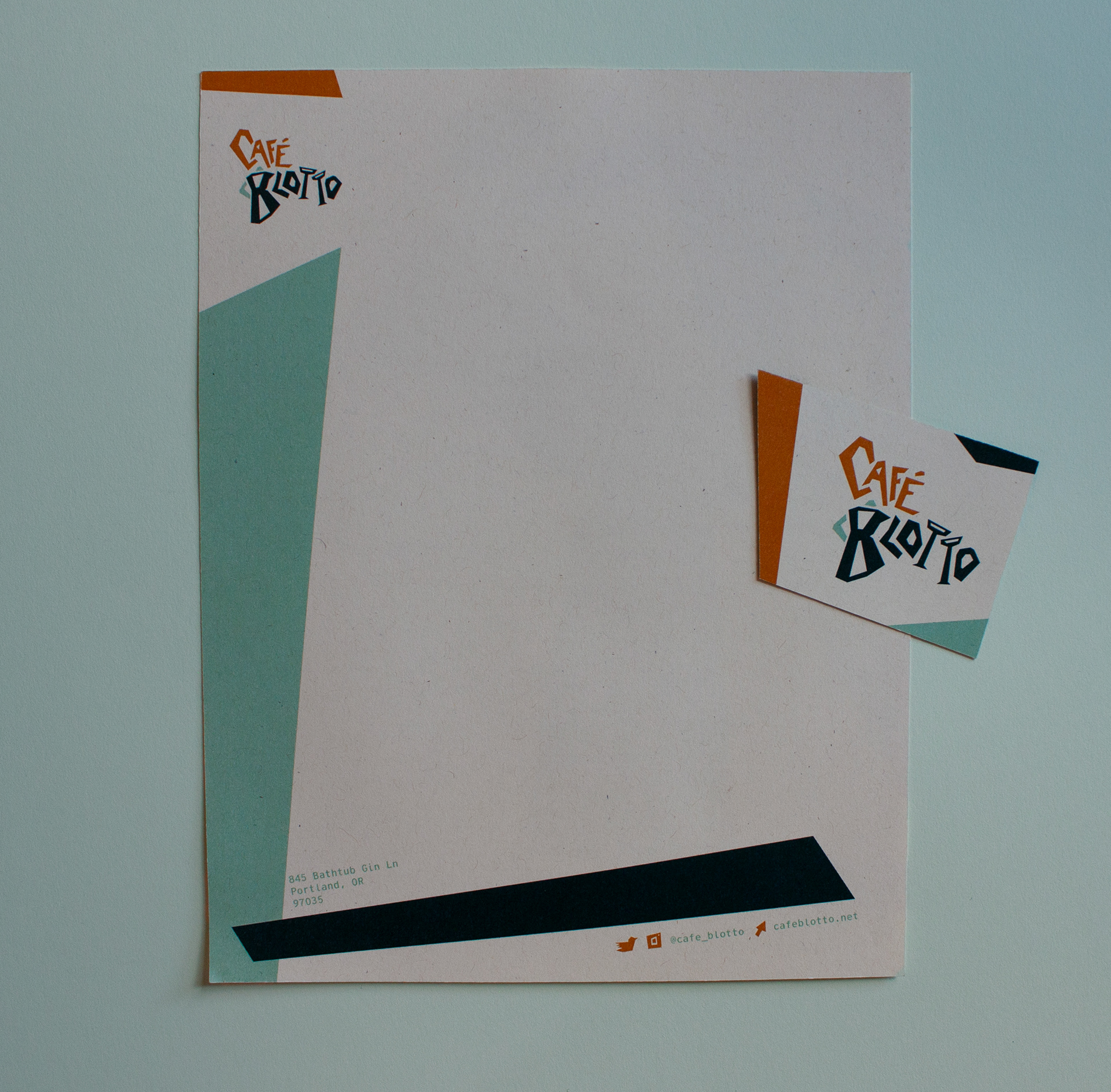
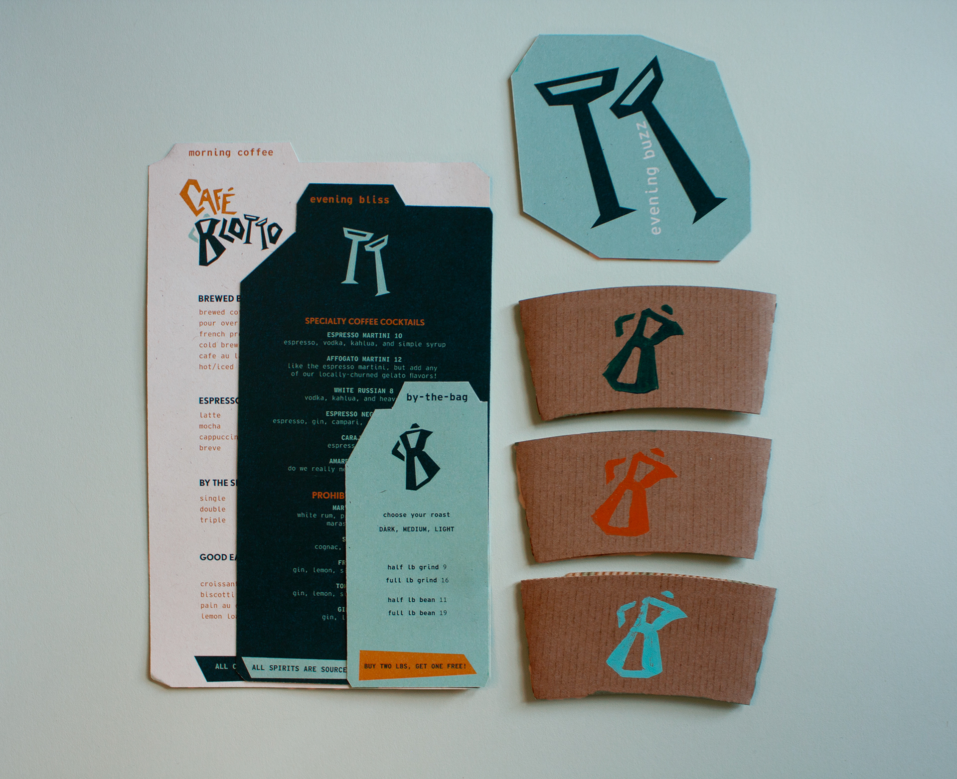
for this branding project, i created a custom typeface to showcase the rhythm the atmosphere this restaurant might create. to continue this rhythm throughout the collateral, i also orchestrated a three-tiered menu, double sided-coasters, and coffee cup sleeves. the careful interconnection of each element in this brand allows for more freedom in creating collateral.
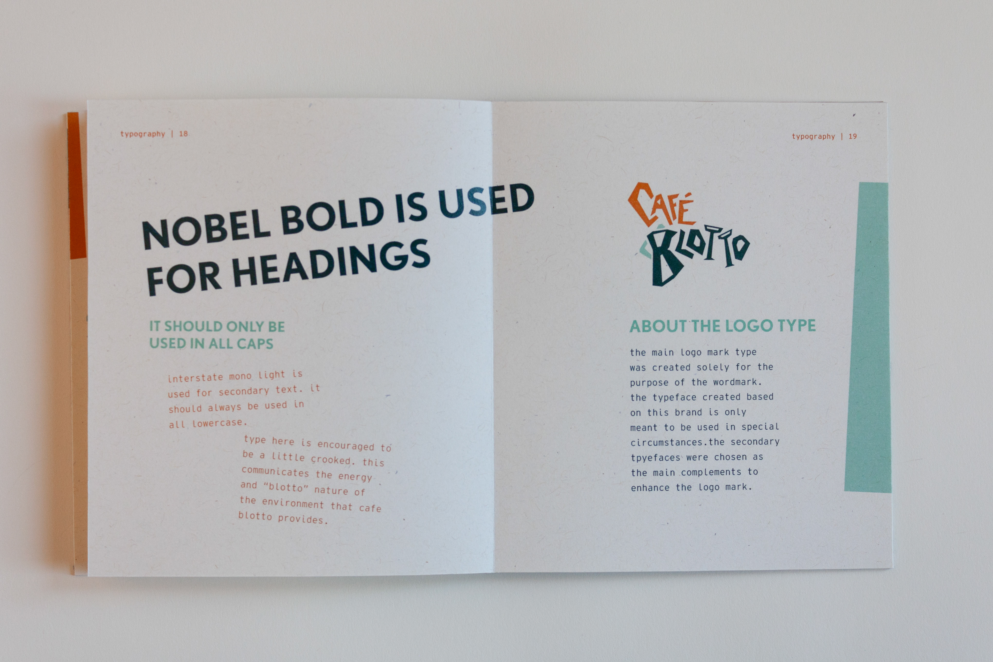
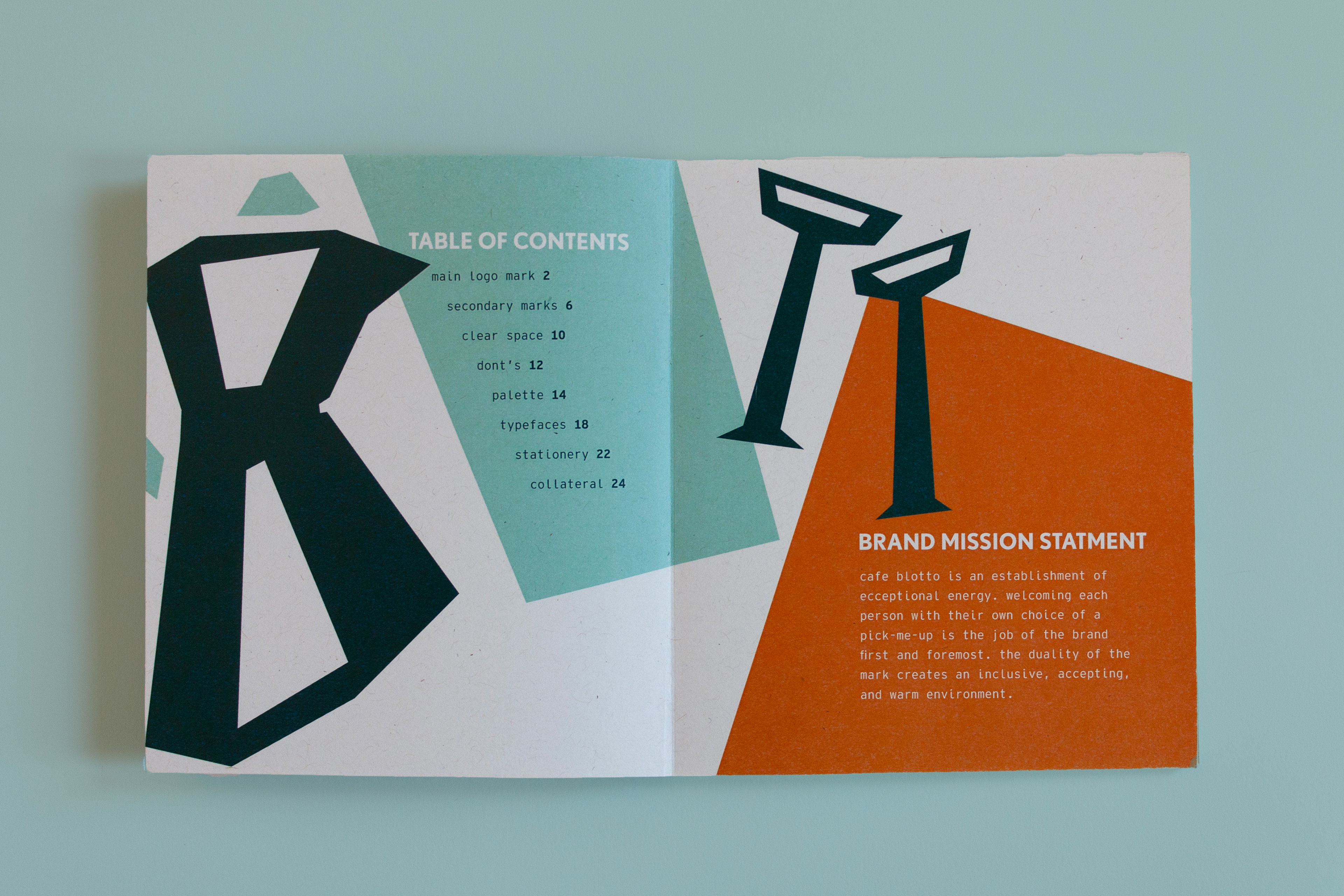
as a third portion of this project, i created a full style guide. following the rules of the branding, i laid out each rule, asset, and use for the logo, alternate marks, patterns, type, and color. in this, i showcase my love for layout, connection with the person working under the brand, and the way design becomes such a connective piece of art in each part of a business.