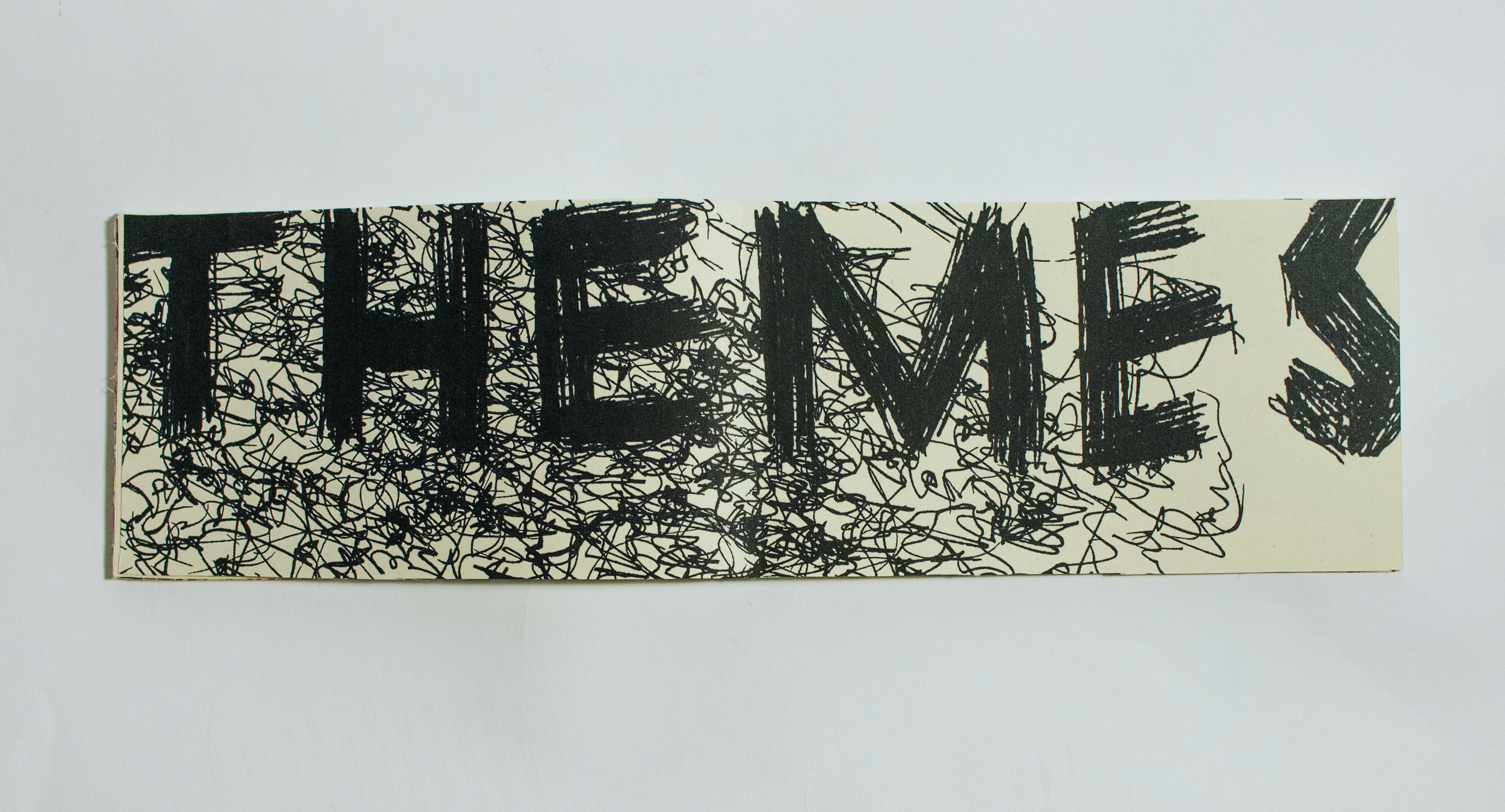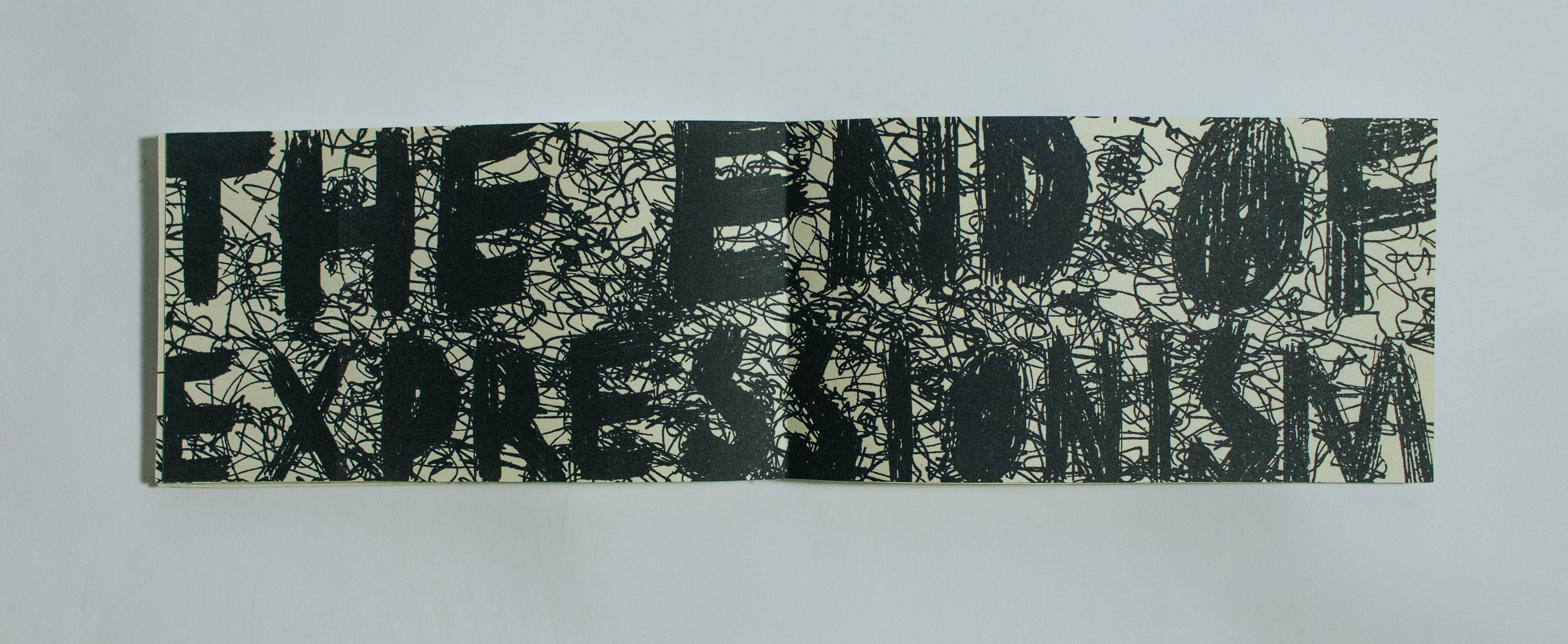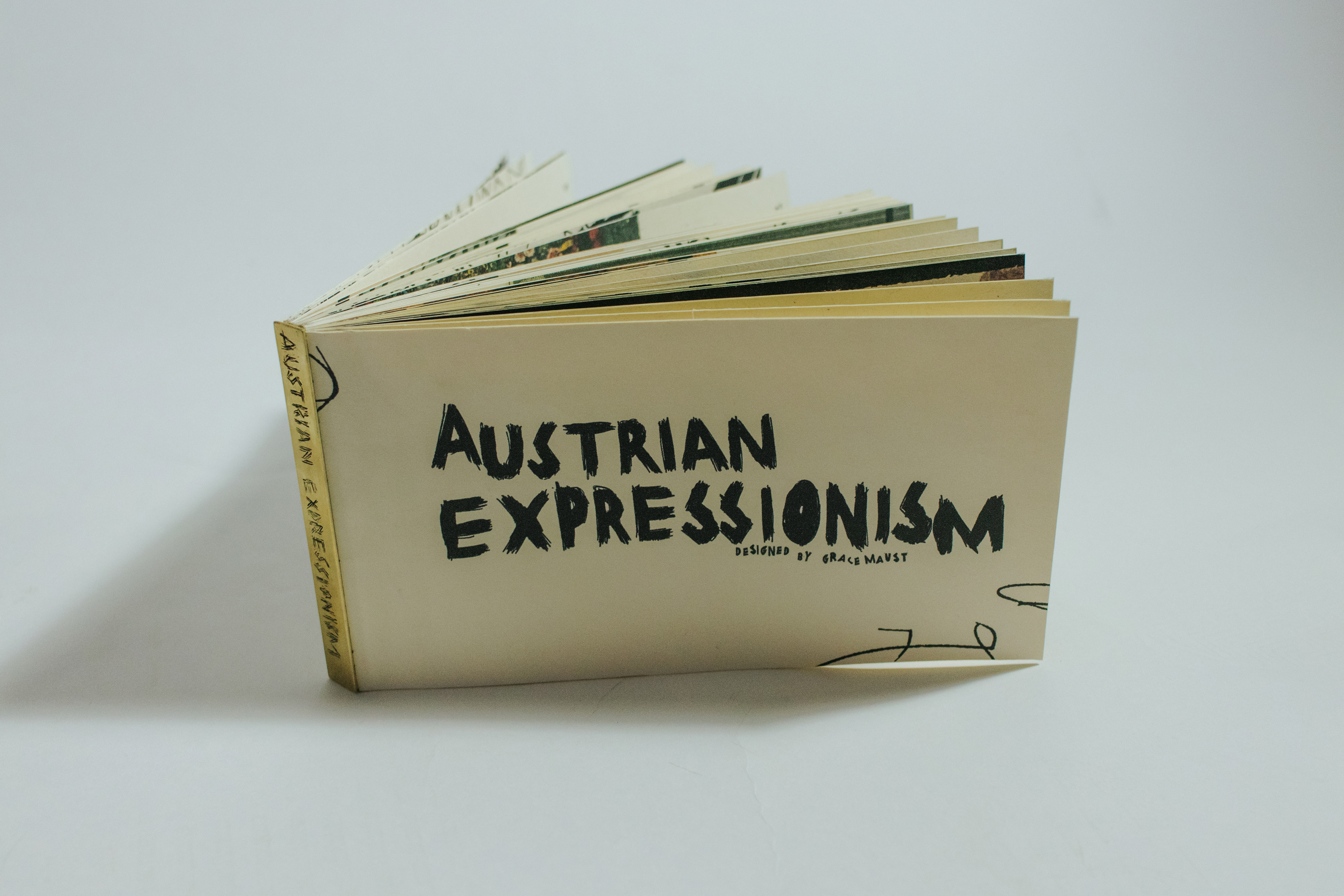
this publication highlights the tumultuous movement of expressionism through prominent austrian artists. with a custom typeface displaying the angst and raw human emotion that fabricated the movement, i showcase the expressionist attraction to texture and vibration of the human spirit and the anguish of life. in my hand-done typography, i mirrored the quick and- expressionistic attitude that painters such as egon schiele and oskar kokoschka would have utilized in their brushstrokes. i used ballpoint pens, ink wash, and a fountain pen to create this hierarchy of texture within my headings; the typeface for my headings was all freehanded based on type from a poster that egon schiele completed for the galerie arnot. as one moves through the book, i use inked line elements as a way to create a more illegible and chaotic feeling throughout, just as austrian expressionists aimed to do through their work.